
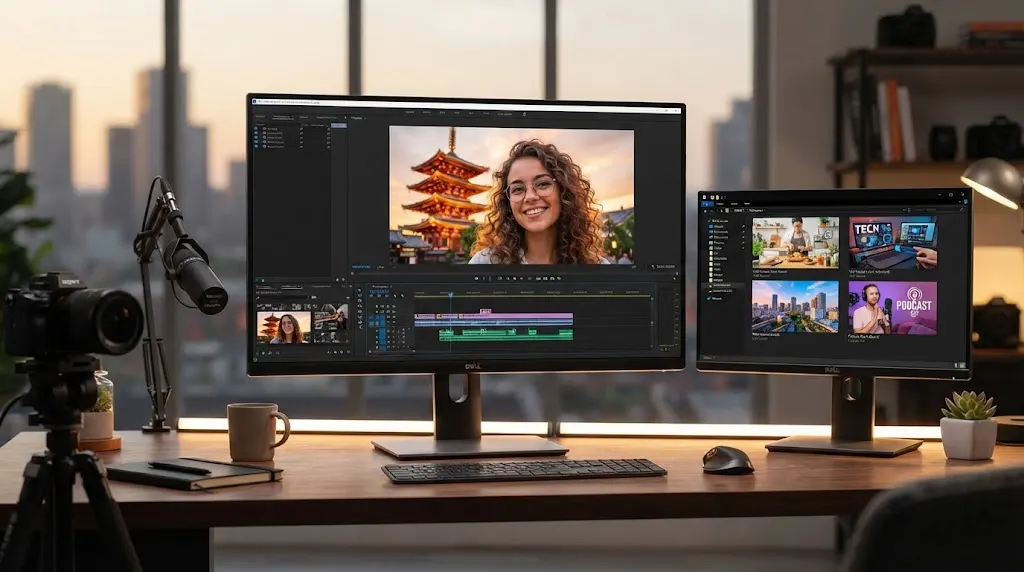

What Is a Thumbnail? Meaning, Size & Uses
A thumbnail is a small preview image that represents a larger piece of visual or digital content before someone opens it. You see thumbnails almost everywhere online, including YouTube, Google Images, websites, online stores, streaming platforms, social media feeds, and computer folders. Their main purpose is to help people quickly understand what a video, article, image, product, or file contains without opening the full item. A well-designed thumbnail can make content easier to browse while also encouraging people to click when something appears relevant or interesting. Because users often make decisions within seconds, thumbnails have become an important part of modern digital communication. They combine visual organization, branding, usability, and marketing within a relatively small image.
Although thumbnails may look simple, their effectiveness depends on several factors, including image dimensions, resolution, aspect ratio, file size, visual clarity, and platform requirements. A thumbnail that looks excellent on a desktop computer may become unreadable when displayed on a small smartphone screen. Similarly, uploading an incorrectly sized image can cause cropping, stretching, poor quality, or unnecessary loading delays. Understanding thumbnail meaning therefore involves more than knowing that it is simply a smaller image. Businesses, marketers, creators, designers, bloggers, and everyday internet users can all benefit from understanding how thumbnail images work. This guide explains thumbnail sizes, common uses, design considerations, file formats, optimization techniques, and practical ways to create previews that remain clear and useful across digital platforms.
What Is a Thumbnail?
A thumbnail is a reduced-size visual representation of a larger image, video, document, web page, or other digital asset. Instead of loading or displaying the complete piece of content, a platform can show a smaller preview that gives users enough information to decide whether they want to view the original. The term is widely used in computing, graphic design, digital marketing, photography, video publishing, and web development. Thumbnails usually preserve the basic appearance of the original content while using smaller image dimensions and often lower file sizes. This makes browsing faster and easier, particularly when many items appear on the same screen. In simple terms, a thumbnail acts like a visual summary that helps users recognize and select digital content.
The name “thumbnail” comes from the idea of something being approximately as small as a person’s thumbnail, although modern digital thumbnails can appear in many different dimensions. The concept became especially useful as graphical computer interfaces and digital media libraries became more common. Instead of listing hundreds of photographs or videos only by filename, software could display miniature previews that allowed users to identify content visually. This dramatically improved navigation because people often recognize an image faster than they remember its filename. Today, the same principle is used throughout websites, applications, search engines, and content platforms. While the actual image may be much larger, the thumbnail provides a convenient visual reference that reduces the amount of space required on the screen.
A thumbnail is not always an automatically resized version of the original image. Many platforms allow creators to upload a custom thumbnail specifically designed to attract attention or communicate information more effectively. A YouTube thumbnail, for example, may use a carefully selected photograph, subject positioning, expressions, contrast, or other visual elements that do not appear exactly in the video’s opening frame. Ecommerce stores may also use optimized product thumbnails that emphasize the item against a clean background. Blog websites can display featured-image thumbnails designed to match the topic of each article. These custom designs give creators greater control over how their content appears before users open it. Therefore, thumbnails can function as both practical previews and deliberate visual marketing assets.
Thumbnail images are particularly valuable when users need to compare multiple options quickly. Consider an online image gallery containing hundreds of photographs from a single event. Loading every photograph at full resolution would consume unnecessary bandwidth and create an inconvenient browsing experience. By displaying smaller thumbnail versions, the website allows visitors to scan many images efficiently and open only the photographs they actually want to see. The same principle applies to product listings, video platforms, document managers, real estate websites, online portfolios, and digital media libraries. Good thumbnails therefore improve both visual organization and website performance. They help users make faster choices while reducing the need to immediately load large amounts of high-resolution content.
The exact meaning of a thumbnail can vary slightly depending on context, but its fundamental purpose remains consistent. On video platforms, it previews a video; in image galleries, it represents a larger photograph; and on websites, it may represent a blog article or landing page. Computer operating systems can generate thumbnails for documents, PDFs, images, and video files so users can identify them without opening every item individually. Social media platforms also create preview images when links or videos appear in a feed. These different examples show why the thumbnail concept is so widely used across digital experiences. Wherever people need to browse several visual or content options efficiently, thumbnails can provide an intuitive way to preview and organize information.
How Do Thumbnails Work?
Thumbnails usually work by displaying a smaller image file or scaled visual representation instead of immediately presenting the original full-size content. When a user uploads an image, video, or document, a platform may automatically create several resized versions for different screens and interface locations. These generated files can then be displayed in galleries, search results, recommendations, feeds, or dashboards. Because the thumbnail dimensions are smaller than the original image dimensions, the file can often load much faster. When the user clicks the preview, the website or application opens the corresponding full-size image, video, product page, or document. This system creates a smoother browsing experience because large digital assets are only loaded when they are actually needed.
Automatic thumbnail generation is common across content management systems, ecommerce platforms, cloud storage services, and media applications. When a website owner uploads a photograph, the system might create small, medium, and large versions of the same image. The smallest version could be used in a related-post section while a larger one appears on an article listing page. This approach helps the website serve images appropriate to the available display area rather than forcing every visitor to download the original high-resolution file. Responsive image technology can make this process even more efficient by selecting different image sizes according to the user’s device. Proper thumbnail generation therefore contributes to faster pages, improved usability, and more efficient bandwidth usage.
Video thumbnails work somewhat differently because the original content is moving rather than static. A video platform may automatically select one or more frames from the uploaded video and offer them as thumbnail options. Many platforms also allow creators to upload a separate custom thumbnail image designed specifically for the video. The thumbnail appears before playback and may be visible in search results, recommended-content sections, channel pages, playlists, or social shares. When the user clicks it, the platform loads the video player and begins the viewing experience. Because the thumbnail may influence whether someone chooses one video over another, video creators often treat thumbnail design as an important part of content packaging rather than a purely technical requirement.
Behind the scenes, thumbnail systems typically rely on image resizing, compression, caching, and content delivery technologies. Resizing reduces the pixel dimensions while compression lowers the amount of data needed to store and transfer the image. Caching allows frequently requested thumbnails to be delivered without generating them repeatedly, while content delivery networks can serve image files from infrastructure geographically closer to the visitor. These processes can significantly improve loading speed when websites contain thousands or millions of visual assets. Developers may also use modern image formats and responsive sizing to deliver the most efficient version available. Although users rarely notice these technical processes, they play an important role in how quickly thumbnail-heavy websites and applications respond.
Some thumbnails are generated dynamically rather than stored permanently as separate files. A server or image-processing service may create the required thumbnail dimensions whenever a particular size is requested. This approach can be useful when websites need many possible image variations across different page layouts or device sizes. However, poorly configured dynamic resizing can increase server workload or create unnecessary duplicate files. For this reason, developers often combine resizing rules, caching strategies, compression, and standardized aspect ratios. The goal is to provide a sharp preview without transferring more data than necessary. Effective thumbnail systems balance image quality, loading speed, storage requirements, visual consistency, and the needs of the platform where the preview will appear.
What Size Should a Thumbnail Be?
There is no single universal thumbnail size because the correct dimensions depend on the platform, content type, design layout, and device where the image will appear. Some thumbnails may be only a few hundred pixels wide, while larger video or social media previews can exceed one thousand pixels. The most important consideration is usually maintaining the recommended aspect ratio and providing enough resolution for the image to remain sharp. Uploading an image that is too small can cause visible pixelation when the platform enlarges it. Uploading an unnecessarily massive file can waste bandwidth without improving visible quality. Creators should therefore check the requirements of each platform rather than assuming one thumbnail dimension will perform perfectly everywhere.
YouTube thumbnails are one of the most familiar examples of platform-specific image sizing. A commonly used YouTube thumbnail size is 1280 × 720 pixels, which follows a 16:9 aspect ratio and works well with widescreen video displays. Creators generally choose high-quality images because thumbnails may appear at different sizes depending on whether viewers are using televisions, desktop computers, tablets, or smartphones. Even though the image may be displayed much smaller in search results, uploading sufficient resolution helps preserve sharpness across devices. The thumbnail should also remain understandable when reduced significantly because mobile users may see only a compact version. Strong composition is therefore just as important as selecting the correct image dimensions.
Website thumbnail sizes are much more flexible because they depend on the site’s layout and content management system. A blog might display featured-image previews at 600 × 400 pixels, while an ecommerce category page may use square product thumbnails such as 500 × 500 pixels. Portfolio websites sometimes use landscape or portrait previews according to the type of work being displayed. Developers may also create several different thumbnail dimensions for the same image so each page component receives an appropriately sized version. The ideal dimensions should match the displayed aspect ratio as closely as possible. When the source thumbnail has a different shape from the display area, automatic cropping may remove important parts of the image.
Aspect ratio describes the proportional relationship between an image’s width and height, and it is one of the most important concepts in thumbnail sizing. A 16:9 thumbnail is wider than it is tall, making it common for videos and widescreen media. Square thumbnails use a 1:1 ratio and are common for product grids, user profiles, and certain social media layouts. Portrait previews may use ratios such as 4:5 or 2:3 depending on the platform and content. Maintaining the expected ratio prevents images from appearing stretched or awkwardly cropped. Designers should position important subjects away from vulnerable edges because some applications may slightly crop previews depending on screen dimensions, interface elements, or responsive layouts.
File size also matters even when the pixel dimensions are technically correct. A thumbnail containing several megabytes of image data may load slowly, particularly for visitors using mobile connections or browsing pages containing dozens of previews. Image compression can reduce file size while preserving enough visual quality for the intended display dimensions. JPEG, PNG, WebP, and newer image technologies may provide different tradeoffs between quality, transparency, browser support, and compression efficiency. The best choice depends on the image and website environment. The objective should be a thumbnail that looks sharp without being unnecessarily heavy. Optimizing dimensions and file size together can improve page speed, user experience, and the overall efficiency of image delivery.
Where Are Thumbnails Commonly Used?
Video platforms are among the most visible places where thumbnails are used. YouTube, streaming services, educational video libraries, and social video applications rely on preview images to help users choose what they want to watch. When many videos compete for attention on the same screen, viewers often evaluate the thumbnail before reading the entire title or description. This makes the video thumbnail part of the discovery experience rather than merely decorative artwork. Creators may choose a representative scene or produce a separate custom design that communicates the video’s topic and emotional tone. Effective thumbnails should accurately represent the content because misleading visuals may generate clicks initially but can reduce trust if viewers feel the video fails to deliver what was implied.
Search engines and image-search platforms also make extensive use of thumbnail images. When users search for photographs, products, recipes, places, or visual information, displaying full-resolution files for every result would be inefficient. Instead, the search interface typically presents a grid of smaller previews that visitors can scan rapidly. Clicking a preview may open a larger image, result page, or additional information about the content. Search thumbnails make visually driven discovery much faster because people can compare several options at once. Website owners should therefore ensure that important images remain recognizable even when displayed at reduced dimensions. Clear imagery, appropriate aspect ratios, and relevant visual content can help users understand what each search result represents.
Ecommerce websites use thumbnails throughout product category pages, search results, recommendation sections, shopping carts, and product galleries. A single product may have several thumbnail images showing different colors, angles, materials, or features. Shoppers can select these miniature previews to switch between larger product photographs without loading an entirely new page. Category thumbnails also allow customers to compare many products rapidly before selecting an item for closer inspection. Because online buyers cannot physically examine products, clear visual presentation becomes especially important. Poor-quality thumbnails may make merchandise appear less trustworthy or difficult to evaluate. Consistent product photography, clean framing, sufficient resolution, and appropriate image optimization can therefore contribute to a smoother ecommerce browsing experience.
Websites and blogs frequently use thumbnails as featured-image previews for articles, case studies, news stories, tutorials, and resource pages. A homepage may display several article cards containing a thumbnail, headline, short description, and publishing information. The image helps visually differentiate topics and can make text-heavy layouts easier to browse. Content management systems often generate these previews automatically from the featured image uploaded for each article. Consistent aspect ratios can create a more organized appearance because every content card occupies predictable space. Publishers should select images that communicate the subject even at small sizes rather than relying on complicated details that disappear after resizing. Strong blog thumbnails can improve both usability and the visual identity of a website.
Thumbnails are also common within computer operating systems, cloud storage applications, digital asset managers, photography tools, and document libraries. Instead of displaying only filenames, these systems can show previews of photographs, videos, presentation slides, PDFs, or other compatible files. This makes it easier to locate the correct asset when users work with large numbers of documents. Designers and photographers particularly benefit from visual previews because filenames may provide little information about the actual content. Cloud collaboration systems can also use document thumbnails to help teams recognize files faster. In these situations, thumbnails are primarily organizational rather than promotional. Their value comes from helping users navigate digital information efficiently without opening every file individually.
Why Are Thumbnails Important?
Thumbnails improve digital usability by allowing people to process information visually before opening the underlying content. Human attention is limited, especially on pages containing dozens of choices, and visual previews can make navigation significantly faster. Instead of reading every filename, title, or description, users can often recognize what they need from the image alone. This is particularly valuable in photo galleries, ecommerce collections, video libraries, and document-management systems. A clear thumbnail reduces uncertainty because it provides immediate context about what will appear after the click. When preview images accurately represent their destination, users can make more confident decisions. This combination of speed and clarity explains why thumbnails have become a standard feature across many digital interfaces.
Thumbnails can also influence click-through rate because visual presentation often affects which content receives attention. Two videos covering similar topics may perform differently if one has a clearer and more compelling thumbnail. The same principle can apply to blog posts, product listings, recommended articles, online courses, and other content cards. However, improving clicks should not mean creating misleading or exaggerated imagery. A strong thumbnail should attract the right audience while accurately representing what the user will find afterward. When the preview and destination align, people are more likely to feel that their click was worthwhile. This relationship between expectation and experience makes thumbnail design part of both marketing performance and user trust.
Brand consistency is another important benefit of well-designed thumbnail images. Businesses and creators can use similar visual styles, photography approaches, layouts, or design elements so their content becomes easier to recognize. Consistency is especially useful when audiences encounter content repeatedly across video platforms, social networks, websites, email campaigns, and search results. Over time, familiar visual patterns can strengthen recognition even before someone reads the publisher’s name. However, consistency should not make every thumbnail look identical because users still need to distinguish individual pieces of content. The best systems provide recognizable visual identity while allowing enough variation for each topic. Thumbnail design can therefore support both navigation and broader brand communication.
From a performance perspective, thumbnails can reduce unnecessary data transfer because websites can display small image versions instead of loading full-resolution originals immediately. This is especially important on pages containing many photographs or products. If a gallery contains fifty images and each original file is several megabytes, loading all of them at full size would create a poor experience for many visitors. Properly optimized thumbnails dramatically reduce the amount of data required for the initial page view. Visitors can then load larger versions only for images they actually choose to inspect. This approach can improve perceived speed while reducing bandwidth consumption. Efficient previews are therefore useful not only for design but also for technical website performance.
Thumbnails also help content creators communicate hierarchy and relevance within crowded digital environments. A well-chosen preview tells users what deserves attention and helps distinguish one item from another. For example, an educational website might use different visual styles for beginner tutorials, advanced courses, and downloadable resources. An online store may use product thumbnails that immediately communicate categories, colors, or variations. A media platform can show genre or subject differences through representative imagery. These visual signals reduce the cognitive effort required to browse large collections. When used thoughtfully, thumbnails become part of information architecture rather than an isolated graphic-design decision. Their effectiveness comes from connecting visual recognition with the user’s underlying navigation goals.
How to Create an Effective Thumbnail
An effective thumbnail begins with a clear visual focus. Because the image may appear relatively small, viewers should be able to identify the main subject without studying complicated details. Photographs with a strong focal point generally remain easier to understand after resizing than crowded scenes containing many competing elements. Creators should consider what users need to recognize immediately and design the composition around that information. The subject should usually be large enough to remain visible on mobile screens and in compact content grids. Background elements can provide context, but they should not overwhelm the central idea. Simplicity does not necessarily mean boring design; instead, it means removing unnecessary visual information that interferes with comprehension.
Contrast can make thumbnail images easier to scan, especially when many previews appear beside one another. A subject that blends into the background may look acceptable at full resolution but become difficult to recognize once the image is reduced. Designers can improve separation through lighting, composition, background selection, depth, and appropriate visual hierarchy. The goal is to make the most important part of the image immediately noticeable without creating an unnatural appearance. Testing the thumbnail at its actual display size is extremely useful because design decisions can look different at full-screen editing dimensions. A strong thumbnail should remain understandable when viewed quickly. If the main idea disappears after reduction, the design probably contains too much detail.
Creators should also consider how thumbnails appear across different devices. Desktop layouts may display large preview cards, while smartphone interfaces can reduce the same image dramatically. Televisions, tablets, search-result pages, and embedded players may each present different viewing conditions. Important subjects should therefore remain clear regardless of display size. Safe positioning can help prevent faces, objects, or important visual information from being cropped when responsive layouts adjust the image. Designers should avoid placing essential details too close to the edges unless the platform’s cropping behavior is completely predictable. Cross-device testing can identify problems before publication. Designing mobile-first is often helpful because a thumbnail that works at small dimensions generally scales more successfully to larger displays.
Image quality should be high enough to look professional without creating unnecessarily large files. Starting with a reasonably high-resolution source gives creators more flexibility when cropping, resizing, and exporting. However, sharpening, compression, and resizing should be handled carefully because aggressive processing can introduce visible artifacts. Blurry photographs, jagged edges, excessive compression, and pixelation may reduce credibility and make content less appealing. At the same time, uploading extremely large files offers little benefit when the thumbnail will only appear within a compact interface. The ideal workflow uses sufficient source quality followed by optimization for the final display environment. Image dimensions, resolution, compression level, and file format should all support that balance.
Finally, creators should evaluate thumbnail performance based on actual user behavior rather than personal preference alone. For video content, click-through rate and watch behavior can provide clues about whether the thumbnail attracts the appropriate audience. Ecommerce teams can analyze product clicks and engagement from category pages. Publishers can compare article-card performance to understand which visual styles make topics easier to recognize. Testing should focus on meaningful changes such as composition, focal point, image choice, or clarity rather than making random adjustments. A thumbnail that receives more clicks but sends poorly matched users to the content may not be truly better. Effective optimization considers both initial engagement and whether the resulting experience satisfies user expectations.
Common Thumbnail File Formats and Optimization Tips
JPEG is one of the most widely used file formats for photographic thumbnails because it can provide relatively small file sizes while maintaining acceptable visual quality. It works particularly well for photographs, realistic scenes, products, travel images, food photography, and other visuals containing many colors or tonal variations. JPEG compression can substantially reduce file size, but excessive compression may create visible artifacts around detailed areas or sharp edges. Designers should therefore experiment with export quality rather than automatically choosing the maximum or minimum setting. For most web thumbnails, the goal is to retain enough clarity for the displayed dimensions while avoiding unnecessary data. JPEG remains a practical option because browser and platform compatibility is extremely broad.
PNG is useful when thumbnails contain transparency, graphics, interface elements, or visual details that need crisp edges. Unlike typical JPEG compression, PNG can preserve image data without introducing the same type of lossy artifacts. However, photographic PNG files may become considerably larger than equivalent JPEG versions, making them less efficient for some thumbnail applications. Designers should choose PNG when its transparency or quality advantages are genuinely useful rather than applying it automatically to every image. Logos, illustrations, icons, and graphics with limited colors can often work well in this format. The correct file type depends on the visual content rather than a universal rule. Testing output size and appearance makes it easier to choose appropriately.
WebP has become a popular web-image option because it can provide strong compression while supporting both photographic and transparent imagery. When implemented properly, WebP thumbnails may achieve smaller file sizes than traditional alternatives while maintaining comparable visible quality. This can help websites reduce page weight, particularly when pages display many images at once. Modern content management systems and image optimization services often generate WebP versions automatically. Site owners should still consider compatibility within their specific technology environment, although support has become widespread across modern browsers. Automated image-delivery systems may choose the most appropriate format according to the requesting browser. Using efficient formats can support faster thumbnail loading without requiring users to sacrifice visual clarity.
Thumbnail optimization should also include resizing images to dimensions appropriate for their actual use. Uploading a 6000-pixel-wide photograph when a website only displays a 300-pixel thumbnail creates unnecessary processing and transfer overhead if the system does not generate a smaller version. Responsive images can help by allowing browsers to choose from several available image sizes depending on screen width and display density. Lazy loading can further improve performance by delaying thumbnails that are below the visible portion of the page until the user scrolls toward them. Together, these techniques reduce unnecessary network activity. Good image optimization therefore involves more than compression alone. Dimensions, format, responsive delivery, and loading behavior should work together.
Creators should also protect visual quality during repeated editing and exporting. Continuously opening and saving compressed image files can gradually reduce quality, particularly when working with lossy formats such as JPEG. Keeping a high-quality master file allows new thumbnails to be exported whenever different dimensions or crops are required. Clear naming conventions can also help teams distinguish original files from optimized web versions. For larger websites, automated image-processing tools can standardize resizing and compression while reducing manual work. Periodic performance checks are useful because image libraries can grow substantially over time. A reliable thumbnail workflow makes it easier to maintain consistent visuals, manageable file sizes, and good loading performance as digital content expands.
Thumbnail Mistakes to Avoid
One common thumbnail mistake is trying to include too much information in a very small space. A design may look impressive while being edited at full size but become chaotic when displayed at the dimensions users actually see. Multiple subjects, tiny visual details, complicated backgrounds, and unnecessary decorative elements can compete for attention. The viewer may then struggle to understand what the content is about. Effective thumbnails usually prioritize one central message or visual idea rather than attempting to summarize every aspect of the content. Reducing clutter can improve recognition and make the preview easier to scan. Creators should repeatedly zoom out or view the image at realistic dimensions while designing to confirm that the important elements remain clear.
Another mistake is using misleading imagery simply to generate more clicks. A dramatic thumbnail may attract attention, but users can become disappointed if the actual video, product, or article does not match what the preview suggested. This can damage trust and potentially reduce long-term engagement even when the initial click-through rate increases. Successful thumbnails should create curiosity without misrepresenting the destination. For example, a product thumbnail should show the actual product accurately, while a video preview should reflect the video’s real subject or tone. Strong visual marketing works best when the expectation created before the click matches the experience afterward. Accuracy is therefore an important part of sustainable thumbnail performance.
Poor cropping can also significantly reduce thumbnail effectiveness. Automatic systems often resize images to predefined aspect ratios, which may remove parts of the original composition. If a person’s face, product, building, or other central subject is located close to an edge, important information may disappear. Creators should preview crops in the exact ratio used by the platform and reposition subjects when necessary. Some systems allow designers to choose a focal point that determines which area should remain visible during responsive cropping. Others require manually prepared images for different layouts. Understanding platform behavior prevents unpleasant surprises after publishing. Safe composition can help the thumbnail remain useful across multiple screen sizes and interface configurations.
Ignoring file size is another frequent problem, particularly on websites with large image galleries or product catalogs. A single heavy thumbnail may not noticeably affect performance, but dozens of unoptimized images can significantly increase page weight. Slow-loading pages may frustrate visitors and create poor experiences on mobile networks. Large images are especially wasteful when the displayed dimensions are only a small fraction of the source resolution. Compression, modern image formats, responsive sizing, caching, and lazy loading can help reduce this unnecessary overhead. Website owners should measure real page performance rather than assuming visually small images are technically lightweight. A thumbnail’s displayed size does not necessarily indicate how much data the browser must download.
Finally, creators should avoid designing thumbnails only according to trends without considering their audience and content type. A visual style that works for entertainment videos may feel inappropriate for professional training, financial information, medical education, luxury products, or technical documentation. Similarly, highly minimal designs may work well for certain brands but provide too little context for users unfamiliar with the content. Thumbnail decisions should reflect audience expectations, platform behavior, brand identity, and the purpose of the preview. Reviewing competitor designs can provide useful ideas, but direct imitation rarely creates lasting differentiation. The strongest thumbnails serve a practical communication purpose first. Trends can influence execution, but clarity, relevance, accuracy, and usability should remain the core priorities.
Frequently Asked Questions About Thumbnails
What does thumbnail mean?
A thumbnail is a small preview image used to represent larger digital content such as a photograph, video, article, product, or document. Users can view the thumbnail first and then select it to open the full content.
What is the standard thumbnail size?
There is no universal standard thumbnail size because dimensions vary between platforms and website layouts. For YouTube, 1280 × 720 pixels with a 16:9 aspect ratio is commonly used, while website and ecommerce thumbnails may use many different sizes.
What is a thumbnail used for?
A thumbnail helps users identify, preview, compare, and select digital content without opening every item individually. Thumbnails are commonly used for videos, images, products, blog posts, documents, search results, galleries, and social media content.
What is the difference between a thumbnail and an image?
An image is the full visual asset, while a thumbnail is typically a smaller preview representing that asset or another piece of content. A custom thumbnail may also be a separately designed image rather than simply a smaller copy of the original.
Which file format is best for thumbnails?
JPEG is commonly suitable for photographic thumbnails, while PNG can be useful for transparency and crisp graphics. WebP can also provide strong web compression and image quality, so the best format depends on the visual content, platform requirements, and website technology.